You’re building a SaaS product on nights and weekends. You can code, but your design skills stop at centering a div. Your landing page looks like it’s from 2008, and your dashboard UI makes users squint. Hiring a designer costs $5,000 minimum, and you’re not ready for that investment yet.
The good news? Design tools have gotten so good that you can create professional-looking products without a design degree or a massive budget. The bad news? There are hundreds of tools claiming to solve your problems, and most waste your time.
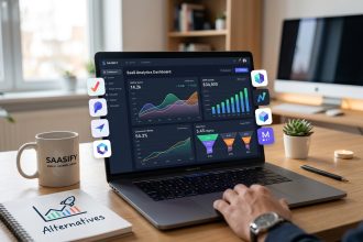
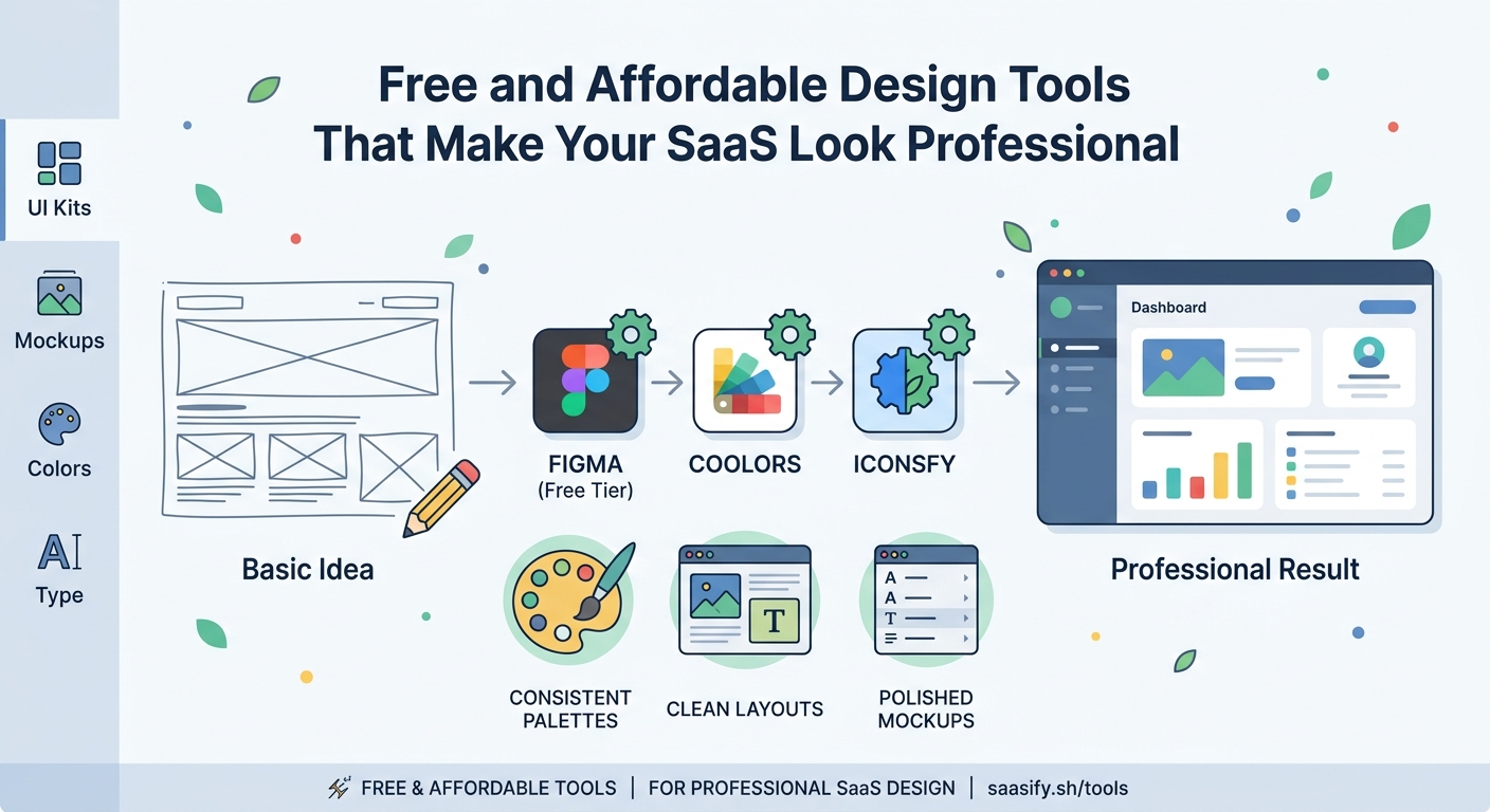
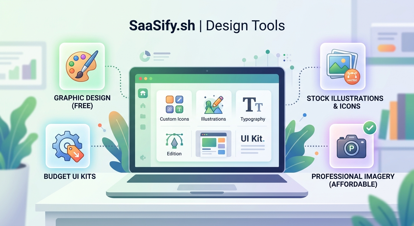
Free design tools for saas founders include Figma for interface design, Canva for marketing graphics, and Penpot for open-source prototyping. Combined with icon libraries like Heroicons and color palette generators like Coolors, you can build professional products without hiring designers. Focus on consistency over creativity, use design systems, and steal inspiration from successful products in your niche.
Interface design tools that actually work for founders
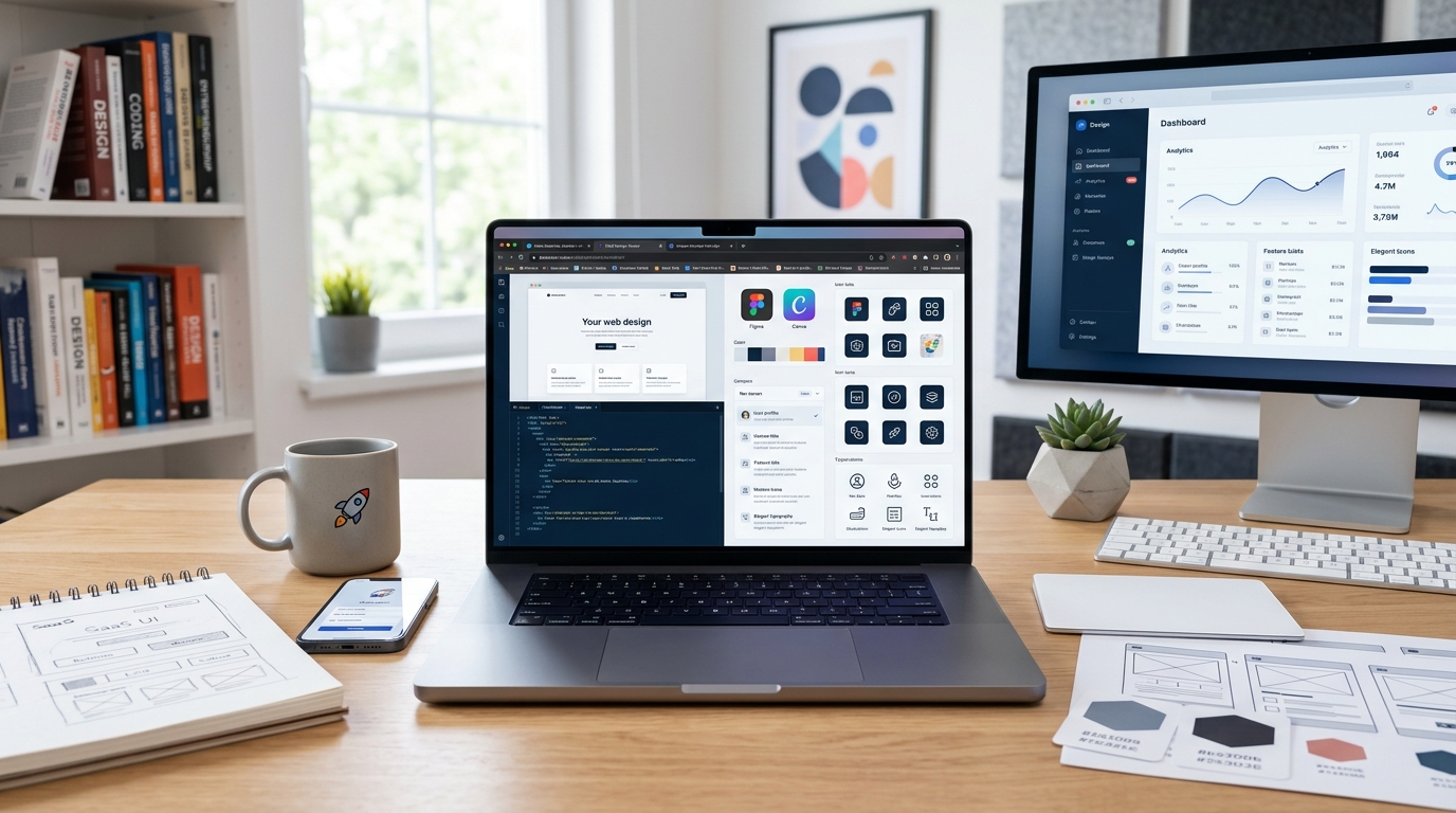
Figma remains the gold standard for SaaS interface design, and its free tier gives you everything needed to design your entire product. You get unlimited files, unlimited collaborators, and access to thousands of free UI kits built by the community.
The real power comes from component libraries. Instead of designing every button and input field from scratch, you can grab pre-built design systems like Untitled UI or Ant Design and customize them for your brand. This cuts design time from weeks to days.
Here’s how to use Figma effectively as a non-designer:
- Find a SaaS UI kit that matches your product type (dashboard, marketplace, tool)
- Duplicate it to your workspace and customize colors and fonts
- Design your core screens using existing components
- Export assets and hand off specs to yourself for development
Penpot offers a completely free, open-source alternative if you prefer not to depend on a commercial platform. It runs in your browser, supports team collaboration, and uses SVG as its native format. The interface feels similar to Figma, making the transition smooth.
The learning curve exists, but it’s gentler than learning actual code. Most founders can design their first usable interface in a weekend.
Building your brand identity without a designer
Your logo doesn’t need to be a masterpiece. It needs to be legible, memorable, and consistent across platforms. Canva’s free tier handles this surprisingly well, offering thousands of templates you can customize in minutes.
Start with a wordmark (text-based logo) rather than attempting complex iconography. Pick a clean font, choose two colors, and you’re 80% done. Successful indie SaaS products like Plausible and Fathom use simple text logos that work perfectly.
For color palettes, Coolors generates beautiful combinations with a single spacebar tap. Lock the colors you like, regenerate the rest, and export the hex codes directly into your CSS. The free version gives you unlimited palette generation.
Typography makes or breaks your design. Google Fonts offers hundreds of professional typefaces at zero cost. Stick to these proven combinations:
- Inter for UI and body text
- Poppins for headings
- JetBrains Mono for code blocks
- Lora for editorial content
Download two fonts maximum. One for headings, one for body text. More than that creates visual chaos.
Icons and illustrations that don’t scream “free”
Heroicons by the Tailwind team offers 300+ MIT-licensed icons in outline and solid styles. They’re designed specifically for interfaces, meaning they look professional at any size. Copy the SVG code directly into your components.
Lucide provides another excellent option with 1,000+ icons in a consistent style. The React, Vue, and Svelte packages make implementation trivial. Both libraries update regularly with new icons based on community requests.
For illustrations, unDraw gives you customizable SVG illustrations that match your brand colors. The quality varies, but the business and tech categories work well for SaaS landing pages. Storyset by Freepik offers animated illustrations if you want something more dynamic.
The key is consistency. Pick one icon library and one illustration style. Mixing sources creates a franken-design that screams amateur.
Design systems that save you from yourself
A design system is just a set of rules you follow so your product doesn’t look like five different people designed it. You need decisions about colors, spacing, typography, and components documented somewhere.
Create a simple design tokens file:
| Token Type | Values | Usage |
|---|---|---|
| Colors | Primary, Secondary, Neutral, Success, Error | Buttons, alerts, text |
| Spacing | 4px, 8px, 16px, 24px, 32px, 48px | Margins, padding, gaps |
| Typography | 12px, 14px, 16px, 18px, 24px, 32px | Text hierarchy |
| Radius | 4px, 8px, 16px | Buttons, cards, modals |
| Shadows | Small, Medium, Large | Elevation levels |
Tailwind CSS enforces these decisions automatically through its utility classes. You can’t accidentally use a random spacing value because it doesn’t exist in the framework. This constraint actually improves your design by limiting bad choices.
If you’re building a saas mvp in 30 days, a pre-built design system saves you a full week of interface work. Use Shadcn UI for React, DaisyUI for Tailwind, or Vuetify for Vue. All offer free, production-ready components.
Screenshot and mockup tools for marketing
Your landing page needs product screenshots that don’t look like boring browser windows. Screely adds beautiful backgrounds, shadows, and browser chrome to any screenshot in seconds. Upload your image, pick a background gradient, and download.
For mobile mockups, Mockuphone wraps your screenshots in realistic device frames. It supports every iPhone and Android model, plus tablets and laptops. The free tier includes unlimited mockups with a small watermark you can crop out.
If you need animated product demos, Screen Studio costs money but offers a free trial. For completely free options, use OBS Studio to record your screen and DaVinci Resolve to edit the footage. Both have steep learning curves but produce professional results.
The fastest path? Take clean screenshots of your actual product in use. Real interfaces beat fake mockups every time. Users want to see what they’re actually getting.
Color psychology and palette building
Colors communicate meaning before users read a single word. Blue suggests trust and stability (why every bank uses it). Green implies growth and health. Red signals urgency or error. Purple feels creative and modern.
For SaaS products, stick to these proven patterns:
- B2B tools: Blue primary, gray neutrals, green for success states
- Creative tools: Purple or pink primary, dark mode friendly
- Developer tools: Orange or green primary, lots of code-friendly neutrals
- Finance tools: Blue or green primary, conservative and trustworthy
Coolors and Paletton both generate accessible color combinations that meet WCAG contrast requirements. This matters more than you think. Poor contrast makes your product unusable for people with vision impairments and looks unprofessional to everyone else.
Use the 60-30-10 rule: 60% neutral colors, 30% primary brand color, 10% accent color. This creates visual hierarchy without overwhelming users.
Free alternatives to Adobe’s expensive suite
Photopea replicates Photoshop’s interface and features in a free web app. It handles PSD files, supports layers and masks, and includes advanced selection tools. The only catch is ads in the sidebar, which disappear if you pay $5/month.
For vector graphics, Inkscape offers professional illustration tools comparable to Adobe Illustrator. It runs on Windows, Mac, and Linux, supports SVG natively, and includes powerful path editing tools. The interface feels dated, but the functionality matches paid alternatives.
GIMP handles photo editing and manipulation for free. It’s not as polished as Photoshop, but it covers 90% of use cases. The learning curve is real, though. Budget a few hours to understand the layer system and tools.
Most SaaS founders never need these heavy tools. Figma handles interface design, Canva covers marketing graphics, and your phone camera captures product photos. Save the advanced software for when you actually need advanced features.
Typography tricks that make your product feel premium
Good typography is invisible. Bad typography screams at users and makes them leave. The difference often comes down to a few simple rules.
Set your body text between 16px and 18px. Smaller text forces users to squint. Larger text feels childish. Line height should be 1.5 to 1.6 times your font size for comfortable reading.
Limit line length to 60-75 characters. Longer lines tire readers. Shorter lines feel choppy. Use max-width on text containers to enforce this automatically.
Create clear hierarchy through size, weight, and color:
- Headings: 2x to 3x body size, bold weight
- Subheadings: 1.5x body size, semibold weight
- Body: 16-18px, regular weight
- Captions: 0.875x body size, regular or light weight
Never use pure black (#000000) for text. It creates harsh contrast that strains eyes. Use dark gray (#1a1a1a or #2d2d2d) instead. Your users’ eyes will thank you.
Google Fonts loads fast and works everywhere. Variable fonts like Inter give you every weight from thin to black in a single file, reducing page load times.
Stealing design inspiration the right way
Every designer copies. The difference between good copying and bad copying is understanding why something works before you implement it.
Browse successful SaaS products in your niche and screenshot their:
- Landing page hero sections
- Pricing tables
- Dashboard layouts
- Empty states
- Onboarding flows
Create a swipe file in Figma or Notion. When you need to design a feature, review your swipe file first. Look for patterns across multiple products. If five successful tools use similar layouts, that layout probably works.
Dribbble and Behance showcase beautiful designs, but most are concept work that never shipped. Real products make compromises for usability. Learn from products people actually use.
Building saas features users actually want means copying patterns users already understand. Don’t reinvent navigation or form layouts. Users have mental models from other products. Match those models.
Animation and micro-interactions without JavaScript libraries
Subtle animations make your product feel responsive and alive. CSS transitions handle 90% of use cases without adding JavaScript bloat.
Add transitions to interactive elements:
button {
  transition: all 0.2s ease;
}

button:hover {
  transform: translateY(-2px);
  box-shadow: 0 4px 8px rgba(0,0,0,0.1);
}
This creates a lift effect that signals interactivity. Keep transitions under 300ms. Longer animations feel sluggish.
For loading states, use CSS animations instead of GIF spinners. They scale perfectly, load instantly, and look modern. Grab free CSS loaders from sites like CSS Loaders or Loading.io.
Page transitions between routes should be instant or under 200ms. Longer transitions frustrate users who are trying to complete tasks. Animation should enhance, not delay.
The best animation is animation users don’t consciously notice. It should feel smooth and natural, not flashy or attention-seeking.
Common design mistakes bootstrap founders make
Using too many fonts creates visual noise. Stick to two typefaces maximum. One for headings, one for everything else. More fonts make your product look unprofessional and slow down page loads.
Inconsistent spacing breaks visual rhythm. If you use 16px padding on one card, use 16px padding on all cards. Random spacing values make your interface feel chaotic. Define a spacing scale and stick to it religiously.
Low contrast text fails accessibility standards and looks amateurish. Test your color combinations with WebAIM’s contrast checker. Aim for at least 4.5:1 for body text, 3:1 for large text.
Centering everything creates boring, static layouts. Use asymmetry strategically. Left-aligned text with right-aligned images creates visual interest and guides the eye through content.
Ignoring mobile design until launch day guarantees a terrible mobile experience. Design mobile-first, then scale up. Most SaaS traffic comes from desktop, but investors and early adopters often check products on phones first.
“Design is not just what it looks like and feels like. Design is how it works. For bootstrap founders, this means focusing on usability over aesthetics. A simple, functional interface beats a beautiful, confusing one every time.” – Advice from successful indie makers
Building a simple design workflow
Start with content, not visuals. Write your landing page copy, list your feature set, and map your user flows before opening Figma. Design follows content, not the other way around.
Create a simple three-step process:
- Wireframe with text and boxes – No colors, no fonts, just layout and hierarchy
- Add your design system – Apply colors, typography, spacing from your tokens
- Polish with shadows and animations – Final 10% that makes it feel finished
This prevents spending hours perfecting a layout that doesn’t actually work. Get the structure right first, make it pretty second.
When building a pre-launch waitlist that actually converts, your landing page design matters less than your value proposition. Spend 80% of your time on copy, 20% on design. Clear benefits beat beautiful gradients.
Test your designs with actual users before building. Show mockups to five people in your target market. If they can’t explain what your product does in 10 seconds, your design failed.
Free resources that actually teach design
Refactoring UI by Adam Wathan and Steve Schoger offers practical design tips specifically for developers. The free content on their Twitter and blog covers spacing, color, typography, and layout better than most paid courses.
Laws of UX explains the psychology behind interface design decisions. Understanding why certain patterns work helps you make better choices without memorizing rules.
Checklist Design provides free checklists for designing common SaaS components like sign-up flows, pricing pages, and dashboards. Each checklist includes best practices and examples.
For video learning, DesignCourse on YouTube covers everything from logo design to full website builds. The quality matches paid courses, and the content updates regularly.
The best teacher is building and shipping. Design your product, launch it, collect feedback, and iterate. You’ll learn more from real user reactions than any tutorial.
Making design decisions when you’re stuck
Decision paralysis kills momentum. When you can’t decide between two design options, choose the simpler one. Complexity rarely improves usability.
Create a simple decision framework:
| Question | Option A | Option B | Winner |
|---|---|---|---|
| Which is simpler? | ⭐ | A | |
| Which loads faster? | ⭐ | A | |
| Which matches patterns users know? | ⭐ | B | |
| Which is easier to maintain? | ⭐ | A |
The option with more stars wins. This removes emotion from design decisions and focuses on practical outcomes.
Time-box design decisions. Give yourself 30 minutes to choose a color palette, not three days. Founders waste weeks perfecting designs that users barely notice. Ship something good enough, then improve based on feedback.
When building your saas landing page, test two versions if you’re truly stuck. A/B testing with real users beats internal debate every time.
Design tools you probably don’t need yet
3D mockup generators look impressive but add zero value for early-stage products. Users care about functionality, not fancy marketing graphics. Save these for later.
Advanced prototyping tools like Principle or Framer Motion offer powerful animations but require significant learning investment. CSS transitions handle 90% of animation needs for free.
Custom illustration packages cost $500 to $5,000 and rarely improve conversion. Generic illustrations from free libraries work fine until you’re making real revenue.
Design subscription services like Adobe Creative Cloud make sense for agencies, not bootstrap founders. You’re paying $50/month for features you’ll never use. Stick with free tools until they genuinely limit your growth.
The best design tool is the one you already know. Master Figma and Canva before exploring alternatives. Depth beats breadth for solo founders.
Getting design feedback without a team
Post your designs in communities like /r/SaaS, Indie Hackers, or Designer News. Be specific about what feedback you need. “Does this look good?” gets useless responses. “Is the pricing table clear?” gets actionable advice.
UsabilityHub offers free first-click tests and preference tests. Upload two design options and see which one users prefer. The free tier includes 10 responses per test, enough to spot obvious problems.
Show your designs to non-technical friends and family. If your mom can’t figure out how to sign up, your design has issues. Technical founders often overestimate user sophistication.
Record yourself using your product. Watch the recording and note every moment of hesitation or confusion. These friction points reveal design problems you’ve become blind to.
The fastest feedback comes from shipping. Put your product in front of real users and watch what they do. Analytics and session recordings show exactly where your design fails.
When to actually hire a designer
Hire a designer when design becomes your bottleneck, not before. If you’re spending 50% of your time on design instead of building features or talking to customers, it’s time.
Good signals for hiring:
- You have paying customers and revenue
- Design decisions are slowing down feature development
- Users complain about specific interface problems
- You’re redesigning the same component for the third time
Bad signals for hiring:
- You haven’t launched yet
- You think better design will magically create demand
- You’re avoiding customer development work
- You want your product to look like a big company’s product
When you do hire, start with a contractor for a specific project. “Redesign our dashboard” works better than “be our designer.” This lets you test the relationship before committing to full-time.
Budget $3,000 to $10,000 for a professional landing page and core interface redesign. Cheaper options exist on Fiverr, but quality varies wildly. More expensive doesn’t always mean better.
Design tools worth paying for eventually
Figma Professional ($12/editor/month) adds unlimited version history and advanced prototyping. Worth it once you’re making changes daily and need to revert mistakes.
Notion ($8/month) keeps your design system, brand guidelines, and asset library organized. The free tier works fine initially, but paid features help as complexity grows.
Loom ($8/month) records video walkthroughs of your designs for remote feedback. The free tier limits video length, which gets annoying fast.
These are worth paying for once you’re generating revenue. Until then, free tiers handle everything you need.
Building confidence in your design skills
You don’t need to become a professional designer. You need to become good enough that design doesn’t hold back your product. That bar is lower than you think.
Most successful indie SaaS products have mediocre design. They win on solving real problems, not winning design awards. Plausible, Fathom, and ConvertKit all launched with basic interfaces that improved over time.
Your first designs will be bad. That’s fine. Every designer’s first work was bad. The difference is they kept designing and got better. You will too.
Start with one screen. Design your sign-up form or dashboard header. Ship it. Get feedback. Improve it. Repeat with the next screen. Small wins build momentum and skills.
The goal isn’t perfection. The goal is good enough to not scare users away. You can achieve that with free tools and consistent effort.
Making your design system scale
As your product grows, maintaining design consistency gets harder. Components multiply, edge cases appear, and your simple color palette needs dark mode variants.
Document decisions as you make them. When you choose a button style, write down the padding, colors, and hover states. Future you will thank past you for this reference.
Build a component library in your framework of choice. Extract repeated UI patterns into reusable components. This enforces consistency automatically and speeds up development.
Version your design system. When you make breaking changes, update the version number and document what changed. This prevents confusion when old screens don’t match new patterns.
Most importantly, keep it simple. Every new component or token adds maintenance burden. Add complexity only when the pain of not having it exceeds the pain of maintaining it.
Designing for the product you have, not the one you want
Bootstrap founders often design for imaginary scale. They create complex dashboards for features that don’t exist yet, or build elaborate onboarding flows for products with three users.
Design for today’s reality. If you have 50 users, you don’t need advanced analytics dashboards. A simple list of recent activity works fine. Add complexity when users actually need it.
This approach saves time and keeps your product focused. Every feature you design is a feature you need to build and maintain. Fewer features mean faster shipping and less technical debt.
When validating your saas idea, design the absolute minimum interface needed to test your hypothesis. Polish comes after validation, not before.
Your first version should feel slightly embarrassing. If it doesn’t, you over-designed and wasted time on features nobody asked for.
Turning design constraints into advantages
Limited design skills force simplicity. You can’t create complex animations or intricate layouts, so you build clean, functional interfaces instead. This often produces better products.
No budget for custom illustrations? Use simple icons and real product screenshots. They communicate more clearly anyway.
Can’t afford a designer? Learn enough to be dangerous, then focus on what you’re actually good at. Your unique value is building products that solve problems, not creating pixel-perfect interfaces.
The best products solve real problems with simple, obvious interfaces. Design excellence matters less than you think. Solving the right problem for the right people matters infinitely more.
Design as a bootstrap founder’s superpower
Learning basic design skills gives you independence. You can test ideas, iterate on feedback, and ship products without coordinating with contractors or agencies. This speed advantage compounds over time.
You’ll never be a professional designer, and that’s fine. You need to be good enough to not embarrass yourself and clear enough to communicate value. Free design tools for saas founders make this achievable without massive time investment.
Start with one tool. Master Figma for interfaces or Canva for marketing graphics. Build one complete screen. Ship it. Get feedback. Improve it. Repeat until your product looks professional enough to charge money for.
The tools exist. The tutorials exist. The only missing ingredient is your willingness to create something imperfect and improve it over time. That’s how every successful indie maker learned design. You can too.