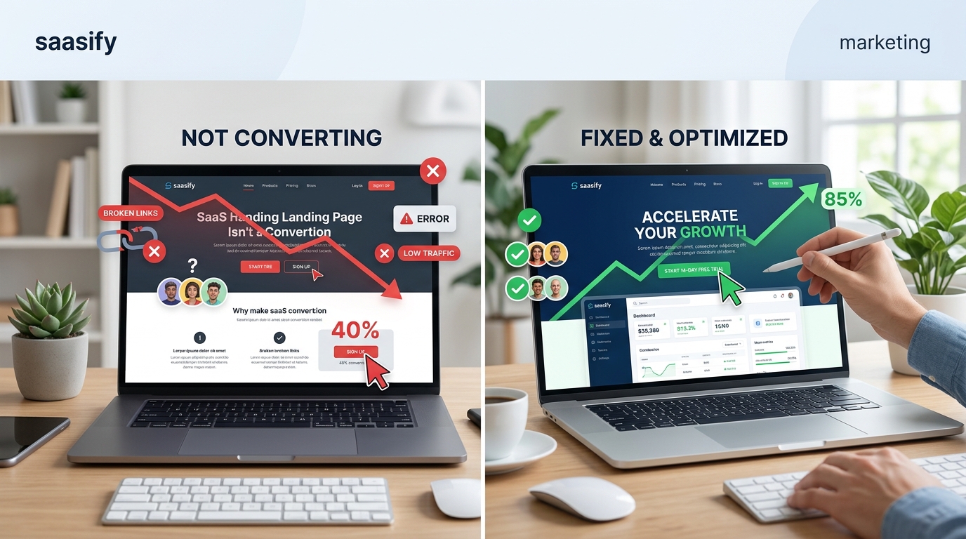
You built a SaaS product people need. You drove traffic to your landing page. But visitors keep leaving without signing up. The traffic numbers look good, but your conversion rate is stuck at 1% or worse. Something’s broken, and you need to figure out what.
Most SaaS landing pages fail to convert because they focus on features instead of outcomes, lack clear value propositions, or create too much friction in the signup process. Fixing conversion rates requires identifying specific problem areas through data analysis, then systematically addressing messaging clarity, design issues, and trust signals. Small, targeted changes often produce dramatic improvements in signup rates.
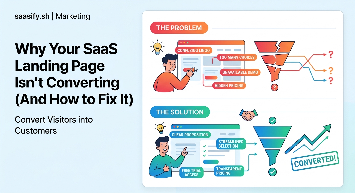
Why Most SaaS Landing Pages Fail
Your landing page might be beautiful, but beauty doesn’t pay the bills. Conversions do.
The problem usually isn’t traffic quality. It’s not your product either. The issue sits right there on the page, in the gap between what visitors need to see and what you’re actually showing them.
Most founders make the same mistakes. They talk about their product’s features instead of the transformation it creates. They assume visitors understand the problem as deeply as they do. They add friction where there should be flow.
Let’s fix that.
The Real Reasons Your Conversion Rate Is Tanking
You’re Talking About Yourself, Not Solving Their Problem
Your headline probably mentions your product name or describes what your software does. But visitors don’t care about your product. They care about their problem.
If you’re selling project management software, “AI-powered project management platform” is weak. “Ship projects on time without the chaos” speaks to their pain.
The first five seconds matter most. Visitors decide whether to stay or bounce based on instant recognition. They need to see their problem reflected back at them immediately.
Your Value Proposition Is Invisible or Unclear
Can someone explain what you do in one sentence after looking at your page for 10 seconds? If not, you’ve already lost them.
Value propositions fail when they’re:
- Too vague (“Better productivity for modern teams”)
- Too technical (“Leveraging machine learning algorithms for optimal resource allocation”)
- Too focused on features (“Built with React and Node.js”)
- Hidden below the fold
Your value prop should answer three questions in seconds: What is this? Who is it for? Why should I care right now?
Trust Signals Are Missing or Weak
Visitors don’t know you. They’re handing over their email, maybe their credit card. They need reasons to trust you won’t waste their time or steal their data.
Missing trust signals include:
- No customer logos or testimonials
- No social proof (user counts, reviews, ratings)
- Generic stock photos instead of real product screenshots
- No security badges or privacy information
- Anonymous team with no faces or names
B2B buyers especially need to see that real companies use your product. A single logo from a recognized brand can boost conversions by 20% or more.
The Signup Process Has Too Much Friction
Every field you add to a form drops your conversion rate. Every extra click creates another exit point.
Common friction points:
- Asking for phone numbers when you don’t need them
- Requiring credit cards for free trials
- Multi-step signups that could be single-step
- Email verification before access
- Forcing users to watch demos before trying the product
The best SaaS landing pages get users into the product in under 30 seconds. They ask for the absolute minimum information upfront.
How to Diagnose Your Specific Conversion Problems
Guessing wastes time. Data tells you exactly where people bail.
Set Up Proper Analytics
You need more than Google Analytics pageviews. Install:
- Heatmap tracking (Hotjar, Microsoft Clarity) to see where people click and how far they scroll
- Session recording to watch actual user behavior
- Conversion funnel tracking to identify exact drop-off points
- Form analytics to see which fields cause abandonment
Run these tools for at least a week before making changes. You need enough data to spot patterns.
Look at These Key Metrics
| Metric | What It Tells You | Red Flag Threshold |
|---|---|---|
| Bounce Rate | Do people immediately leave? | Above 70% |
| Time on Page | Are they reading your content? | Under 30 seconds |
| Scroll Depth | Do they see your CTA? | Less than 50% scroll |
| Form Start Rate | Do people attempt signup? | Under 10% |
| Form Completion Rate | Is your form too long? | Under 50% |
If your bounce rate is high but time on page is normal, your traffic source might be mismatched. If scroll depth is low, your above-the-fold content isn’t compelling enough to continue.
Run User Tests
Watch five people use your landing page while thinking out loud. You’ll spot issues analytics can’t show you.
Ask them:
- What do you think this product does?
- Who do you think this is for?
- Would you sign up? Why or why not?
- What questions do you still have?
The confusion points they hit are conversion killers.
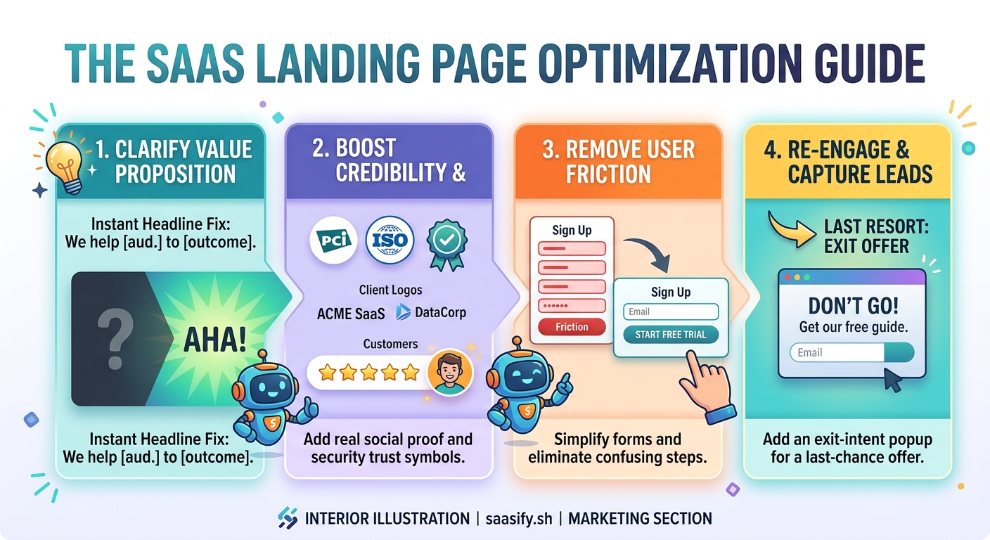
Fixing Your Messaging
Rewrite Your Headline
Your headline should follow this formula: [Desired Outcome] without [Main Pain Point].
Examples:
- “Close more deals without endless follow-ups”
- “Ship bug-free code without slowing down sprints”
- “Onboard customers without building custom flows”
Test headlines by reading them to someone unfamiliar with your product. If they can’t immediately tell you what problem it solves, rewrite it.
Clarify Your Subheadline
The subheadline adds specificity. It answers “how?” or “for whom?”
If your headline is “Close more deals without endless follow-ups,” your subheadline might be “Automated email sequences that feel personal, designed for B2B sales teams.”
Show Outcomes, Not Features
Instead of listing what your product has, show what users can do with it.
Feature-focused copy:
– “Advanced analytics dashboard”
– “Unlimited integrations”
– “Real-time collaboration”
Outcome-focused copy:
– “Spot revenue trends before your competitors do”
– “Connect your entire tech stack in minutes”
– “Get feedback from your team while you’re still designing”
People buy results, not capabilities.
“Customers don’t want a quarter-inch drill. They want a quarter-inch hole.” This applies perfectly to SaaS landing pages. Show the hole, not the drill specs.
Reducing Friction in Your Signup Flow
Simplify Your Form
Cut every field that isn’t absolutely necessary for account creation.
Minimum viable signup:
1. Email address
2. Password
That’s it. You can ask for names, company size, and use cases after they’ve experienced value.
Remove the Credit Card Requirement
If you offer a free trial, make it actually free. Requiring credit card details upfront tanks conversion rates by 30% to 50%.
You’ll get more signups without the card requirement. Yes, some won’t convert to paid. But the volume increase more than compensates.
Use Social Signup Options
Adding “Continue with Google” or “Continue with GitHub” reduces friction significantly. Users trust these auth providers and don’t want to create another password.
Make social signup prominent, not hidden at the bottom in small text.
Show Progress for Multi-Step Flows
If you must use multiple steps, show a progress indicator. “Step 2 of 3” reduces anxiety and abandonment.
People complete tasks when they know how much work remains.
Building Trust Faster
Add Real Customer Testimonials
Generic praise doesn’t work. “Great product!” means nothing.
Effective testimonials include:
- Specific outcomes (“Cut onboarding time from 2 weeks to 2 days”)
- Full names and companies
- Photos of real people
- Job titles that match your target audience
Place testimonials near decision points, especially above or next to your CTA.
Display Customer Logos
If you have recognizable customers, show their logos prominently. If you don’t have big names yet, show quantity instead: “Trusted by 1,200+ SaaS companies.”
Include Product Screenshots
Stock photos kill credibility. Real screenshots prove your product exists and works.
Show your actual interface solving the specific problem mentioned in your headline. Annotate screenshots to highlight key features that deliver the promised outcome.
Add Security and Compliance Badges
For B2B SaaS especially, display:
- SOC 2 compliance
- GDPR compliance
- SSL encryption
- Privacy policy links
- Data residency information
Place these in your footer and near signup forms.
Testing Your Way to Better Conversions
Start With High-Impact Changes
Don’t test button colors first. Test the things that matter most:
- Headline variations
- Value proposition clarity
- Number of form fields
- Social proof placement
- CTA copy
Run tests for at least two weeks or until you reach statistical significance. Tools like Google Optimize or VWO make this straightforward.
Test One Thing at a Time
Changing your headline, CTA, and form fields simultaneously means you won’t know which change moved the needle.
Isolate variables. Test headline A vs. headline B. Pick the winner. Then test CTA variations.
Document Everything
Keep a spreadsheet of every test:
- What you tested
- Date range
- Traffic volume
- Conversion rates for each variant
- Statistical confidence level
- Why you think it won or lost
This creates a knowledge base for future optimization.
Common Fixes That Work Immediately
Some changes produce results within days:
- Moving your CTA above the fold: If users have to scroll to find your signup button, 40% will never see it
- Removing optional form fields: Each removed field typically improves conversion by 5% to 10%
- Adding a video demo: Product videos can boost conversions by 80% when they show real usage
- Fixing mobile experience: Over 50% of traffic is mobile; a broken mobile page kills half your potential conversions
- Speeding up page load: Every second of load time costs you 7% of conversions
Check these basics before running complex A/B tests.
When Your Traffic Source Is the Problem
Sometimes your landing page is fine. The traffic is wrong.
If you’re getting visitors from broad keywords who aren’t actually experiencing the problem you solve, no amount of optimization will help.
Check your traffic sources:
- Are paid ad keywords too general?
- Is your content attracting the wrong audience?
- Are you targeting the right job titles in outreach?
Match your traffic source to your ideal customer profile. A 2% conversion rate with perfect-fit visitors beats 0.5% with high but mismatched traffic.
Turning Browsers Into Believers
Your SaaS landing page not converting isn’t a death sentence. It’s a diagnosis.
Most conversion problems stem from a handful of fixable issues: unclear messaging, hidden value propositions, excessive friction, or missing trust signals. You don’t need a complete redesign. You need systematic improvements based on real user behavior.
Start with analytics. Find where people leave. Fix that specific problem. Test the change. Measure results. Repeat.
The difference between a 1% conversion rate and a 5% conversion rate is often just a better headline, a simpler form, and proof that real people get real results from your product. Make those changes today, and watch your signup numbers climb tomorrow.