You’re staring at your pricing page wondering why visitors aren’t converting. You’ve got three tiers. The features make sense. The prices feel reasonable. But something isn’t clicking.
The problem isn’t what you’re selling. It’s how you’re presenting the choice.
Pricing tier psychology isn’t about tricking people. It’s about understanding how humans make decisions under uncertainty and designing your tiers to reduce friction at every step.
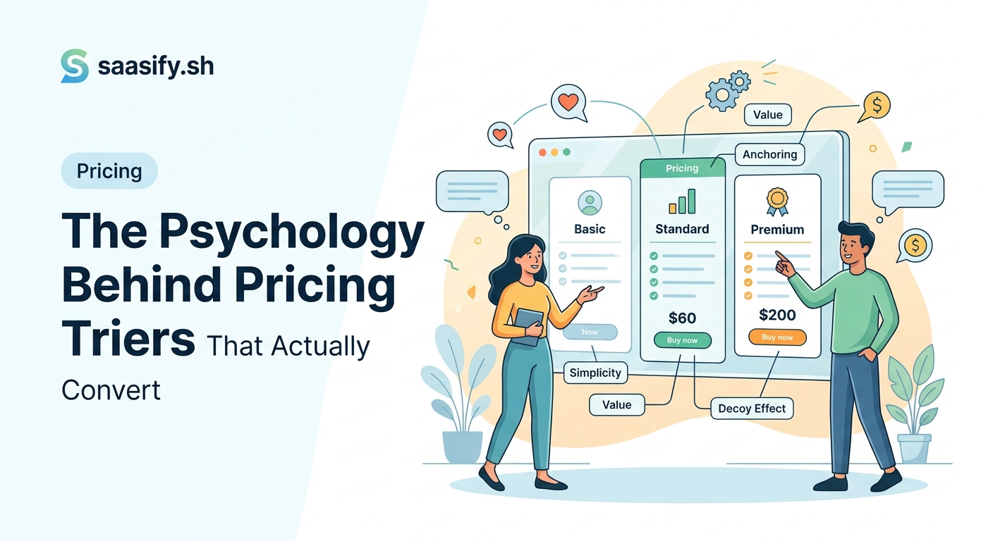
Pricing tier psychology leverages cognitive biases like anchoring, loss aversion, and choice paralysis to guide customers toward the right plan. The most effective pricing pages use three tiers with clear differentiation, position the middle tier as the default choice, and frame value around outcomes rather than features. Small design changes based on psychological principles can double conversion rates without changing your product or pricing.
Why three tiers outperform two or four
Three tiers create a psychological sweet spot.
Two tiers force a binary choice. You’re either in or out. There’s no middle ground, no compromise option. Customers feel pressure to commit fully or walk away.
Four or more tiers trigger decision paralysis. Too many options make people freeze. They can’t evaluate the differences. They postpone the decision. They leave.
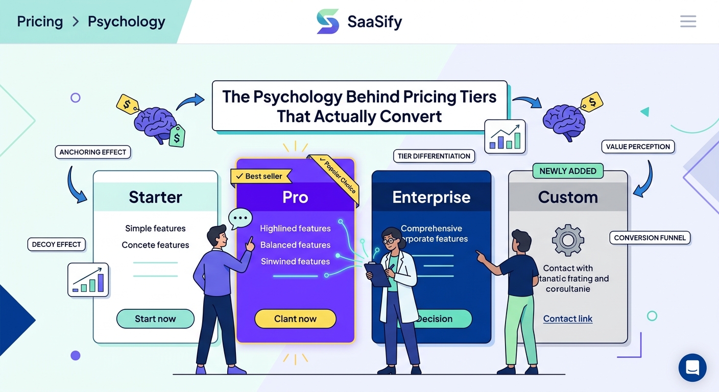
Three tiers give you a decoy, a target, and an anchor.
The decoy (usually your lowest tier) exists to make the middle tier look better. The target (your middle tier) is where you want most customers to land. The anchor (your highest tier) makes the middle tier feel reasonable by comparison.
This isn’t manipulation. It’s reducing cognitive load. You’re helping people make a decision they already want to make.
Most SaaS companies see 60-70% of customers choose the middle tier when it’s positioned correctly. That’s not an accident.
The anchoring effect shapes every pricing decision
People don’t evaluate prices in isolation. They evaluate them relative to other prices they see.
Show someone a $99 plan first, and a $29 plan looks like a bargain. Show them the $29 plan first, and the $99 plan feels expensive.
This is anchoring. The first number you see becomes your reference point for everything that follows.
Smart pricing pages put the highest tier on the left (in left-to-right reading cultures). This anchors visitors to the premium price first. Everything else looks more affordable by comparison.
Even if only 5% of customers choose your premium tier, it serves a critical function. It reframes how people perceive your middle tier.
A $49 plan next to a $99 plan feels like a smart middle ground. The same $49 plan next to a $19 plan feels expensive.
The premium tier doesn’t need to convert. It needs to make your target tier look attractive.
Loss aversion drives more decisions than potential gains
People hate losing things more than they love gaining things.
This cognitive bias, called loss aversion, is why free trials convert better than money-back guarantees. It’s why “Don’t miss out” outperforms “Get access.” It’s why your tier naming matters more than you think.
Frame your tiers around what customers lose by choosing lower tiers, not what they gain by upgrading.
Instead of “Pro plan includes advanced analytics,” try “Basic plan limited to 7-day data retention.” Same information, different framing. The second version creates urgency through potential loss.
Your feature comparison table should highlight what’s missing from lower tiers, not just what’s included in higher ones. Use visual cues like grayed-out checkmarks or “Upgrade to unlock” labels.
This approach works because it shifts the default in the customer’s mind. Instead of asking “Should I pay more?” they ask “Can I afford to go without this?”
When you’re building features users actually want, think about how to frame them as losses when absent, not just gains when present.
The decoy effect makes your target tier irresistible
Here’s a pricing trick that feels like magic but is pure psychology.
Add a tier that’s intentionally unattractive. Not fake, just clearly inferior value. This is your decoy.
Let’s say you want people to choose your $49/month plan. Create a $39/month plan that’s only slightly cheaper but significantly more limited. Maybe it has 80% fewer features for only 20% less money.
Suddenly, the $49 plan looks like an obvious choice. You’re getting so much more for just $10 extra.
The decoy tier doesn’t need to sell. It needs to make your target tier look like the rational choice.
This works because humans are bad at absolute value judgments but excellent at relative comparisons. We can’t easily determine if $49/month is a good price for project management software. But we can easily see that $49 is way better value than $39 when we compare the feature lists.
Your decoy should be close enough in price to invite comparison but different enough in value to make the choice obvious.
How to structure your three tiers for maximum conversions
Here’s a framework you can implement today.
-
Start with your target tier. This is where you want 60-70% of customers to land. Price it at your desired average revenue per user.
-
Create your premium tier at 2-3x the target price. Include everything from the target tier plus high-value features that only power users need. This tier should serve 10-20% of customers and act as an anchor for everyone else.
-
Design your basic tier at 40-50% of the target price. Include just enough to be functional but create obvious limitations. This tier converts 15-25% of customers and makes the target tier look generous.
-
Name them based on identity, not features. “Starter,” “Professional,” “Enterprise” works because it tells customers who each tier is for. People self-select based on how they see themselves.
-
Highlight the target tier visually. Use a different background color, add a “Most popular” badge, make it slightly larger. Visual hierarchy guides the eye and the decision.
The goal isn’t to hide information or create confusion. It’s to create a clear path of least resistance toward the option that serves most customers best.
Feature differentiation that customers actually understand
Your tier differences need to be obvious at a glance.
Avoid these common mistakes:
| Mistake | Why it fails | Better approach |
|---|---|---|
| Listing 30+ features per tier | Creates information overload | Show 5-7 key differentiators |
| Using technical jargon | Customers don’t understand the value | Frame features as outcomes |
| Making differences too subtle | Hard to justify the price jump | Create clear capability gaps |
| Burying important limits in footnotes | Customers feel tricked later | Put limits front and center |
| Identical features with quantity differences | Feels arbitrary and confusing | Bundle features by use case |
Your feature list should answer one question: “What can I do with this tier that I can’t do with the cheaper one?”
Focus on capabilities, not counts. “Unlimited team members” is more compelling than “Up to 50 users” even though they might serve the same customer base.
Use progressive disclosure. Show the headline features on the pricing page. Let curious customers click to see the full comparison. Don’t force everyone to process every detail upfront.
Pricing page design patterns that reduce friction
The visual presentation of your tiers matters as much as the tiers themselves.
Put your tiers side by side, not stacked vertically. Horizontal comparison is easier for the brain to process. People can scan left to right and make direct comparisons.
Use consistent vertical alignment for your feature lists. Each feature should appear at the same height across all tiers. This makes it easy to see what’s included or missing at each level.
Show prices prominently with clear typography. The number should be the largest element in each tier card. Monthly and annual pricing should be easy to toggle without page reload.
Add visual indicators for your target tier. A subtle background color, a “Recommended” badge, or a slightly raised card all signal where you want people to land.
Include a clear call-to-action button on every tier. “Start free trial,” “Get started,” or “Contact sales” depending on your model. Never make people hunt for how to buy.
Remove navigation and other distractions from your pricing page. This is a decision page. Every element should support that decision or get out of the way.
The role of social proof in tier selection
People look to others when making uncertain decisions.
Your pricing page should include signals about what other customers choose. A “Most popular” badge on your target tier isn’t just decoration. It’s social proof that reduces decision anxiety.
Consider adding customer counts to each tier. “Join 5,000+ teams on Professional” tells visitors this is a safe, validated choice. It also subtly communicates that the Basic tier might be for smaller, less serious users.
Testimonials work better when matched to specific tiers. Show a quote from a professional user next to the Professional tier. Show an enterprise customer quote next to the Enterprise tier.
This helps visitors see themselves in the customer stories and self-select the appropriate tier.
When you’re thinking about how to validate your pricing, remember that social proof becomes more valuable as you gather more customers.
Annual vs monthly pricing psychology
Offering both annual and monthly billing adds another psychological layer.
Most SaaS companies offer 15-20% off for annual commitments. This creates a mini-anchoring effect within each tier. The annual price makes the monthly price feel more expensive, nudging customers toward the bigger commitment.
But the real psychology is about loss aversion again. Once someone commits annually, they’re locked in. The switching cost is higher. The commitment is deeper.
Frame annual pricing as savings, not as a bigger upfront cost. “$40/month billed annually” feels better than “$480/year” even though they’re identical.
Use a toggle to switch between monthly and annual views. Default to annual if that’s what you want to sell. The default option gets chosen more often simply because it requires no action.
Show the savings clearly. “Save $120/year” or “2 months free” makes the value obvious. Don’t make people do math.
Common pricing tier mistakes that kill conversions
Here are the mistakes I see most often:
Too many tiers. Four or more options paralyze customers. They can’t evaluate the differences. They postpone the decision.
Unclear differentiation. If customers can’t quickly understand why one tier costs more, they default to the cheapest option or leave entirely.
Missing the middle tier. Two-tier pricing forces a binary choice. There’s no compromise, no middle ground. Conversion rates suffer.
Hiding limits. Customers who hit unexpected limits after signing up feel deceived. They churn. Be upfront about restrictions.
Feature parity across tiers. If your tiers only differ in usage limits (users, projects, storage), you’re missing psychological levers. Bundle features by customer type instead.
No visual hierarchy. If all tiers look equally important, customers don’t know where to focus. Guide them with design.
Complicated pricing calculators. If customers need to estimate their usage to calculate their price, you’ve added friction. Simplify or provide clear guidance.
The goal is to make the decision easy, not to extract maximum revenue from every customer. When customers feel good about their choice, they stick around longer.
Testing your pricing tiers without losing revenue
You can’t optimize pricing tier psychology without testing.
Start with qualitative research. Show your pricing page to 10-15 people in your target audience. Watch where their eyes go. Ask them to think aloud as they evaluate the tiers. You’ll spot confusion and friction immediately.
Run A/B tests on tier positioning, naming, and visual hierarchy. Test one variable at a time. Give each test at least 2-4 weeks to gather meaningful data.
Track these metrics:
- Conversion rate by tier
- Average revenue per user
- Time spent on pricing page
- Scroll depth and heat maps
- Upgrade and downgrade rates after signup
Small changes can have outsized effects. Changing a tier name from “Basic” to “Starter” increased conversions by 18% for one SaaS I advised. The psychology of “starting” felt more positive than being “basic.”
Consider running low-cost experiments on your pricing page before committing to major changes.
Value metrics that align with customer psychology
Your pricing tiers should scale with value delivery, not arbitrary limits.
Per-user pricing works when your product’s value grows with team size. Per-project pricing works when customers run distinct initiatives. Usage-based pricing works when consumption correlates with value.
The best value metrics are:
- Easy to understand and predict
- Aligned with how customers measure value
- Difficult to game or work around
- Scalable as customers grow
Avoid value metrics that punish success. If your product helps customers send more emails, don’t charge per email sent. That creates negative associations between using your product and spending more money.
Frame your limits positively. “Up to 10 projects” feels restrictive. “Perfect for managing 10 projects” feels like you understand their needs.
When you’re deciding whether usage-based pricing makes sense, consider how it affects customer psychology, not just revenue modeling.
The psychology of free tiers and trials
Free tiers and free trials leverage different psychological principles.
Free tiers use the endowment effect. Once customers start using your product, they feel ownership. Taking it away (by limiting features) feels like a loss. They upgrade to avoid that loss.
Free trials use urgency and scarcity. The ticking clock creates pressure to make a decision. Customers either commit before the trial ends or lose access.
Free tiers work better for viral products where free users drive paid acquisition. Free trials work better for high-touch products where you need committed users to see value.
Consider offering both. A limited free tier for casual users and trials of paid tiers for serious prospects. This captures both audiences without forcing a single strategy.
The decision between offering a free plan or just a free trial depends on your product, market, and growth strategy.
How enterprise tiers change the psychology
Enterprise tiers don’t follow the same rules as self-serve tiers.
They typically show “Contact sales” instead of a price. This isn’t about hiding the cost. It’s about signaling that this tier is different. It’s customized. It’s negotiated.
The psychology shifts from self-service decision-making to relationship-building. Price becomes less important than fit, support, and customization.
Your enterprise tier should include features that only make sense at scale: SSO, advanced permissions, dedicated support, SLAs, custom contracts.
These features don’t just justify higher prices. They signal who this tier is for. Small teams don’t need SSO. Enterprise buyers expect it.
The enterprise tier also serves as an aspirational anchor for self-serve customers. It shows where they could grow. It makes the professional tier feel accessible by comparison.
Putting pricing tier psychology into practice
Start by auditing your current pricing page against these principles.
Do you have three tiers? Is the middle tier visually highlighted? Are your feature differences obvious? Does your premium tier anchor the others effectively?
Make one change at a time. Test it. Measure the impact. Iterate.
Remember that pricing tier psychology isn’t about manipulation. It’s about reducing friction and helping customers make confident decisions.
The best pricing pages feel simple and obvious. Customers know exactly which tier fits their needs. They feel good about their choice. They convert.
That’s the goal. Not to trick anyone, but to make the path clear. Your tiers should reflect real value differences and serve distinct customer segments. The psychology just helps people see those differences and choose confidently.
Start with the framework in this article. Adapt it to your product and audience. Test relentlessly. And watch your conversion rates climb.